") ArkUI如何自定義彈窗(eTS)
ArkUI如何自定義彈窗(eTS)
自定義彈窗其實(shí)也是比較簡(jiǎn)單的,通過(guò)CustomDialogController類(lèi)就可以顯示自定義彈窗。
接下來(lái)我們通過(guò)代碼來(lái)看一下
大家也都用過(guò)@Entry,@Component等彈窗的話(huà),只要用@CustomDialog就可以
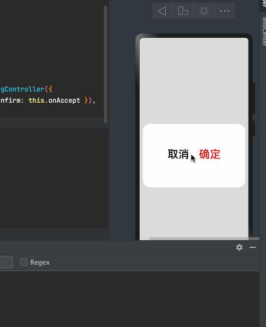
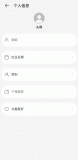
先來(lái)預(yù)覽一下我實(shí)現(xiàn)的效果:
import
CustomDialogExample
from
'./customdialog'
?
@
Entry
@
Component
struct
Index
{
?
// 方式一:使用箭頭函數(shù)
onAccept
=
()
=>
{
console
.
info
(
'確定'
)
this
.
dialogController
.
close
();
}
dialogController
:
CustomDialogController
=
new
CustomDialogController
({
builder
:
CustomDialogExample
({
cancel
:
this
.
onCancel
,
confirm
:
this
.
onAccept
}),
?
alignment
:
DialogAlignment
.
Center
,
cancel
: ()
=>
{
console
.
log
(
"cancel"
)
// 點(diǎn)擊蒙層的回調(diào)
},
autoCancel
:
true
,
// 允許點(diǎn)擊蒙層關(guān)閉彈窗
customStyle
:
false
// 使用自定義樣式
})
?
onCancel
() {
console
.
info
(
'取消'
)
}
?
build
() {
Column
({}) {
Button
(
' 自定義彈窗'
)
.
onClick
(()
=>
{
//打開(kāi)彈窗
this
.
dialogController
.
open
();
})
?
?
}.
width
(
"100%"
).
height
(
"100%"
).
alignItems
(
HorizontalAlign
.
Center
).
justifyContent
(
FlexAlign
.
Center
)
}
}
/*
* Copyright (c) 2021 JianGuo Device Co., Ltd.
* Licensed under the Apache License, Version 2.0 (the "License");
* you may not use this file except in compliance with the License.
* You may obtain a copy of the License at
*
* http://www.apache.org/licenses/LICENSE-2.0
*
* Unless required by applicable law or agreed to in writing, software
* distributed under the License is distributed on an "AS IS" BASIS,
* WITHOUT WARRANTIES OR CONDITIONS OF ANY KIND, either express or implied.
* See the License for the specific language governing permissions and
* limitations under the License.
*/
?
//通過(guò)CustomDialogController類(lèi)顯示自定義彈窗。
@
CustomDialog
struct
CustomDialogExample
{
controller
:
CustomDialogController
cancel
: ()
=>
void
confirm
: ()
=>
void
?
build
() {
?
?
Flex
({
justifyContent
:
FlexAlign
.
Center
,
alignItems
:
ItemAlign
.
Center
,
alignContent
:
FlexAlign
.
Center
}) {
Button
(
'取消'
).
fontSize
(
36
)
.
onClick
(()
=>
{
//方式二:關(guān)閉彈窗
this
.
controller
.
close
()
this
.
cancel
()
}).
(
0xffffff
).
fontColor
(
Color
.
Black
)
Button
(
'確定'
).
fontSize
(
36
)
.
onClick
(()
=>
{
// this.controller.close()
this
.
confirm
()
}).
backgroundColor
(
0xffffff
).
fontColor
(
Color
.
Red
)
}.
margin
({
bottom
:
10
}).
width
(
"100%"
).
height
(
200
)
}
?
}
export
default
CustomDialogExample
上面就是一個(gè)簡(jiǎn)單的自定義彈窗
接下來(lái)看一下它的有關(guān)屬性
CustomDialogController 定義了 open() 和 close() 方法,它們說(shuō)明如下:
open:打開(kāi)對(duì)話(huà)框,如果對(duì)話(huà)框已經(jīng)打開(kāi),則再次打開(kāi)無(wú)效。
close:關(guān)閉對(duì)話(huà)框,如果對(duì)話(huà)框已經(jīng)關(guān)閉,則再次關(guān)閉無(wú)效。
value:創(chuàng)建控制器需要的配置參數(shù),
- CustomDialogControllerOptions
說(shuō)明如下:
builder:創(chuàng)建自定義彈窗的構(gòu)造器。
cancel:點(diǎn)擊蒙層的事件回調(diào)。
autoCancel:是否允許點(diǎn)擊遮障層退出。
alignment:彈窗在豎直方向上的對(duì)齊方式。
offset:彈窗相對(duì) alignment 所在位置的偏移量。
customStyle:彈窗容器樣式是否自定義。
源碼
declare interface CustomDialogControllerOptions {
/**
* Custom builder function.
* @since 7
*/
builder: any;
?
/**
* Defines the cancel function.
* @since 7
*/
cancel?: () => void;
?
/**
* Defines if use auto cancel when click on the outside of the dialog.
* @since 7
*/
autoCancel?: boolean;
?
/**
* Defines the dialog alignment of the screen.
* @since 7
*/
alignment?: DialogAlignment;
?
/**
* Defines the dialog offset.
* @since 7
*/
offset?: Offset;
?
/**
* Defines if use costom style.
* @since 7
*/
customStyle?: boolean;
?
/**
* Grid count of dialog.
* @since 8
*/
gridCount?: number;
}
DialogAlignment的位置
| 名稱(chēng) | 描述 |
|---|---|
| Top | 垂直頂部對(duì)齊。 |
| Center | 垂直居中對(duì)齊。 |
| Bottom | 垂直底部對(duì)齊。 |
| Default | 默認(rèn)對(duì)齊。 |
| TopStart8+ | 左上對(duì)齊。 |
| TopEnd8+ | 右上對(duì)齊。 |
| CenterStart8+ | 左中對(duì)齊。 |
| CenterEnd8+ | 右中對(duì)齊。 |
| BottomStart8+ | 左下對(duì)齊。 |
| BottomEnd8+ | 右下對(duì)齊。 |
參考文檔
自定義彈窗
語(yǔ)法糖
-
Component
+關(guān)注
關(guān)注
0文章
13瀏覽量
8974 -
OpenHarmony
+關(guān)注
關(guān)注
26文章
3824瀏覽量
18144
發(fā)布評(píng)論請(qǐng)先 登錄
基于ArkUI eTS開(kāi)發(fā)的堅(jiān)果食譜(NutRecipes)
HarmonyOS開(kāi)發(fā)實(shí)例:【自定義Emitter】
HarmonyOS開(kāi)發(fā)案例:【彈窗使用】

HarmonyOS開(kāi)發(fā)案例:【 自定義彈窗】
OpenHarmony應(yīng)用開(kāi)發(fā)之自定義彈窗
OpenHarmony自定義組件介紹
三種自定義彈窗UI組件封裝的實(shí)現(xiàn)
自定義視圖組件教程案例
在OpenHarmony上如何使用不同的彈窗
自定義算子開(kāi)發(fā)
鴻蒙ArkUI開(kāi)發(fā)-應(yīng)用添加彈窗


 工商網(wǎng)監(jiān)
評(píng)論