 鴻蒙ArkUI開發-Tabs組件的使用
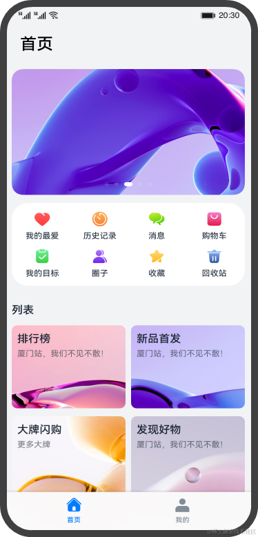
在我們常用的應用中,經常會有視圖內容切換的場景,來展示更加豐富的內容。比如下面這個頁面,點擊底部的頁簽的選項,可以實現“首頁”和“我的” 兩個內容視圖的切換。
ArkUI開發框架提供了一種頁簽容器組件Tabs,開發者通過Tabs組件可以很容易的實現內容視圖的切換。頁簽容器Tabs的形式多種多樣,不同的頁面設計頁簽不一樣,可以把頁簽設置在底部、頂部或者側邊。

本文將詳細介紹Tabs組件的使用。
Tabs組件的簡單使用
Tabs組件僅可包含子組件TabContent,每一個頁簽對應一個內容視圖即TabContent組件。下面的示例代碼構建了一個簡單的頁簽頁面:
@Entry
@Component
struct TabsExample {
 private controller: TabsController = new TabsController()

 build() {
 Column() {
 Tabs({ barPosition: BarPosition.Start, controller: this.controller }) {
 TabContent() {
          Column().width('100%').height('100%').backgroundColor(Color.Green)
        }
        .tabBar('green')

 TabContent() {
          Column().width('100%').height('100%').backgroundColor(Color.Blue)
        }
        .tabBar('blue')

 TabContent() {
          Column().width('100%').height('100%').backgroundColor(Color.Yellow)
        }
        .tabBar('yellow')

 TabContent() {
          Column().width('100%').height('100%').backgroundColor(Color.Pink)
        }
        .tabBar('pink')
      }
      .barWidth('100%') // 設置TabBar寬度
      .barHeight(60) // 設置TabBar高度
      .width('100%') // 設置Tabs組件寬度
      .height('100%') // 設置Tabs組件高度
      .backgroundColor(0xF5F5F5) // 設置Tabs組件背景顏色
    }
    .width('100%')
    .height('100%')
  }
}
效果圖如下:

上面示例代碼中,Tabs組件中包含4個子組件TabContent,通過TabContent的tabBar屬性設置TabBar的顯示內容。使用通用屬性width和height設置了Tabs組件的寬高,使用barWidth和barHeight設置了TabBar的寬度和高度。

說明
- TabContent組件不支持設置通用寬度屬性,其寬度默認撐滿Tabs父組件。
- TabContent組件不支持設置通用高度屬性,其高度由Tabs父組件高度與TabBar組件高度決定。
設置TabBar布局模式
因為Tabs的布局模式默認是Fixed的,所以Tabs的頁簽是不可滑動的。當頁簽比較多的時候,可能會導致頁簽顯示不全,將布局模式設置為Scrollable的話,可以實現頁簽的滾動。 Tabs的布局模式有Fixed(默認)和Scrollable兩種:
- BarMode.Fixed:所有TabBar平均分配barWidth寬度(縱向時平均分配barHeight高度),頁簽不可滾動,效果圖如下:

- BarMode.Scrollable:每一個TabBar均使用實際布局寬度,超過總長度(橫向Tabs的barWidth,縱向Tabs的barHeight)后可滑動。

- 當頁簽比較多的時候,可以滑動頁簽,下面的示例代碼將barMode設置為BarMode.Scrollable,實現了可滾動的頁簽:
@Entry
@Component
struct TabsExample {
 private controller: TabsController = new TabsController()

 build() {
 Column() {
 Tabs({ barPosition: BarPosition.Start, controller: this.controller }) {
 TabContent() {
          Column()
            .width('100%')
            .height('100%')
            .backgroundColor(Color.Green)
        }
        .tabBar('green')

 TabContent() {
          Column()
            .width('100%')
            .height('100%')
            .backgroundColor(Color.Blue)
        }
        .tabBar('blue')

        ...

      }
      .barMode(BarMode.Scrollable)
      .barWidth('100%')
      .barHeight(60)
      .width('100%')
      .height('100%')
    }
  }
}
設置TabBar位置和排列方向 Tabs組件頁簽默認顯示在頂部,某些場景下您可能希望Tabs頁簽出現在底部或者側邊,您可以使用Tabs組件接口中的參數barPosition設置頁簽位置。此外頁簽顯示位置還與vertical屬性相關聯,vertical屬性用于設置頁簽的排列方向,當vertical的屬性值為false(默認值)時頁簽橫向排列,為true時頁簽縱向排列。 barPosition的值可以設置為BarPosition.Start(默認值)和BarPosition.End:
- BarPosition.Startvertical屬性方法設置為false(默認值)時,頁簽位于容器頂部。
Tabs({ barPosition: BarPosition.Start }) {
  ...
}
.vertical(false)
.barWidth('100%')
.barHeight(60)
效果圖如下:

vertical屬性方法設置為true時,頁簽位于容器左側。
Tabs({ barPosition: BarPosition.Start }) {
  ...
}
.vertical(true)
.barWidth(100)
.barHeight(200)
效果圖如下:

- BarPosition.Endvertical屬性方法設置為false時,頁簽位于容器底部。
Tabs({ barPosition: BarPosition.End }) {
  ...
}
.vertical(false)
.barWidth('100%')
.barHeight(60)
效果圖如下:

vertical屬性方法設置為true時,頁簽位于容器右側。
Tabs({ barPosition: BarPosition.End}) {
  ...
}
.vertical(true)
.barWidth(100)
.barHeight(200)
效果圖如下:

自定義TabBar樣式
TabBar的默認顯示效果如下所示:
往往開發過程中,UX給我們的設計效果可能并不是這樣的,比如下面的這種底部頁簽效果:

TabContent的tabBar屬性除了支持string類型,還支持使用@Builder裝飾器修飾的函數。您可以使用@Builder裝飾器,構造一個生成自定義TabBar樣式的函數,實現上面的底部頁簽效果,示例代碼如下:
@Entry
@Component
struct TabsExample {
 @State currentIndex: number = 0;
 private tabsController: TabsController = new TabsController();

 @Builder TabBuilder(title: string, targetIndex: number, selectedImg: Resource, normalImg: Resource) {
 Column() {
      Image(this.currentIndex === targetIndex ? selectedImg : normalImg)
        .size({ width: 25, height: 25 })
      Text(title)
        .fontColor(this.currentIndex === targetIndex ? '#1698CE' : '#6B6B6B')
    }
    .width('100%')
    .height(50)
    .justifyContent(FlexAlign.Center)
    .onClick(() = > {
 this.currentIndex = targetIndex;
 this.tabsController.changeIndex(this.currentIndex);
    })
  }

 build() {
 Tabs({ barPosition: BarPosition.End, controller: this.tabsController }) {
 TabContent() {
        Column().width('100%').height('100%').backgroundColor('#00CB87')
      }
      .tabBar(this.TabBuilder('首頁', 0, $r('app.media.home_selected'), $r('app.media.home_normal')))

 TabContent() {
        Column().width('100%').height('100%').backgroundColor('#007DFF')
      }
      .tabBar(this.TabBuilder('我的', 1, $r('app.media.mine_selected'), $r('app.media.mine_normal')))
    }
    .barWidth('100%')
    .barHeight(50)
    .onChange((index: number) = > {
 this.currentIndex = index;
    })
  }
}
示例代碼中將barPosition的值設置為BarPosition.End,使頁簽顯示在底部。使用@Builder修飾TabBuilder函數,生成由Image和Text組成的頁簽。同時也給Tabs組件設置了TabsController控制器,當點擊某個頁簽時,調用changeIndex方法進行頁簽內容切換。 最后還需要給Tabs添加onChange事件,Tab頁簽切換后觸發該事件,這樣當我們左右滑動內容視圖的時候,頁簽樣式也會跟著改變。
審核編輯 黃宇
-
鴻蒙
+關注
關注
59文章
2531瀏覽量
43788 -
OpenHarmony
+關注
關注
27文章
3835瀏覽量
18174
發布評論請先 登錄
HarmonyOS實戰:組件化項目搭建
Kuikly鴻蒙版正式開源 —— 揭秘卓越性能適配之旅
2025開源鴻蒙開發者大會圓滿落幕
DialogHub上線OpenHarmony開源社區,高效開發鴻蒙應用彈窗
開源啦!!!基于鴻蒙ArkTS封裝的圖表組件《McCharts》,大家快來一起共創
Get這個秘籍,鴻蒙原生應用頁面滑動絲滑無比
華為推出RN/H5多設備自適應組件庫
鴻蒙原生開發手記:01-元服務開發
Taro 鴻蒙技術內幕系列(二):如何讓 W3C 標準的 CSS跑在鴻蒙上

Taro鴻蒙技術內幕系列(一):如何將React代碼跑在ArkUI上
鴻蒙Flutter實戰:07混合開發

鴻蒙開發:【頁面棧及任務鏈】


 工商網監
工商網監
評論