") 什么是CircleIndicator?CircleIndicator的源碼實現(xiàn)
什么是CircleIndicator?CircleIndicator的源碼實現(xiàn)
UI界面是應(yīng)用程序可視化必不可少的部分。設(shè)計精致的UI界面可以使得整個可視化應(yīng)用程序給用戶留下深刻的印象,是改善用戶界面體驗最直接的方式。
ArkUI開發(fā)框架為開發(fā)者提供了豐富的UI原生組件,如Navigation(Page頁面的根容器)、ScrollBar(滾動條組件)、Swiper(滑動容器)及Tabs(通過頁簽進行內(nèi)容視圖切換的容器組件)等。其中,Swiper組件和Tabs組件在應(yīng)用程序開發(fā)中對于指示器的使用引入較多,但是直接使用原生的Swiper組件和Tabs組件不適用于表現(xiàn)復(fù)雜的UI指示器交互變化。因此,我們針對Swiper組件和Tabs組件在指示器應(yīng)用方向做了一個簡單的封裝,以CiecleIndicator三方組件的形式提供應(yīng)用程序依賴使用,從而提升了ArkUI開發(fā)框架的UI界面之指示器風(fēng)格多樣化的能力。
CircleIndicator介紹
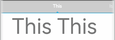
CircleIndicator組件UI效果展示
圓形指示器:
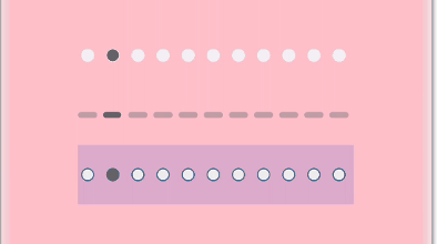


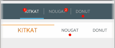
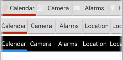
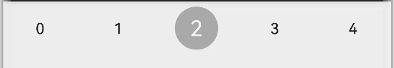
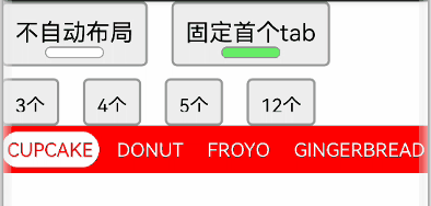
什么是CircleIndicator?
CircleIndicator顧名思義,它指的是圓形指示器。不過在我們OpenHarmony三方組件中的CircleIndicator組件不再是狹義的圓形指示器,而是將多種表現(xiàn)形式的指示器匯集為一體的歸一化指示器合集組件。CircleIndicator的源碼實現(xiàn)
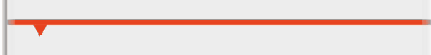
這里我們以CircleIndicator組件源碼中的TriangularIndicator.ets文件為源碼解析樣例對象展開分析。首先創(chuàng)建TriangularIndicator.ets文件,使用命名空間建立TriangularIndicator初始化模型:namespace TriangularIndicator {export class Model {//設(shè)置指示器高度mHeight: number = 18//設(shè)置指示器寬度mWidth: number = lpx2px(720)//設(shè)置指示器背景色mBackgroundColor: string//字段過多,此處進行省略//各字段set與get方法,此處只以height字段為例public getHeight(): number {return this.mHeight}public setHeight(height: number): Model {this.mHeight = heightreturn this}//觸摸事件攔截onPageTouch: (event: TouchEvent, currentIndicator: number) => voidpublic notifyTouch(event: TouchEvent, currentIndex: number) {this.onPageTouch(event, currentIndex)}//設(shè)置構(gòu)造器private tabsController: TabsController(tabsController: TabsController) {this.tabsController = tabsController}//頁面切換監(jiān)聽indexChange: (itemIndex: number) => voidpublic setChangeListener(callback: (index: number) => void): Model{this.indexChange = callbackreturn this}}
將TriangularIndicator應(yīng)用組件化:
最后將TriangularIndicator暴露出來供外部引用:struct TriangularIndicator {//獲取TriangularIndicator實例model: TriangularIndicator.Model = new TriangularIndicator.Model(null)//初始化指示器當(dāng)前indexitemIndex: number//設(shè)置指示器總條數(shù)count: number = 0//再分別實現(xiàn)itemIndexChange、aboutToAppear、onTouch、getOffset方法,此處實現(xiàn)不做展示//再在build方法里面描述UI結(jié)構(gòu)build() {Column() {Rect({ width: this.model.mWidth, height: this.model.mLineHeight }).fill(this.model.mLineColor)Polygon().points(this.model.mReverse ?[[px2vp(this.model.mWidth) / (this.count * 2) - this.model.mTriangleWidth / 2, this.model.mLineHeight - this.model.mYOffset],[px2vp(this.model.mWidth) / (this.count * 2), this.model.mLineHeight + this.model.mTriangleHeight - this.model.mYOffset],[px2vp(this.model.mWidth) / (this.count * 2) + this.model.mTriangleWidth / 2, this.model.mLineHeight - this.model.mYOffset]] :[[px2vp(this.model.mWidth) / (this.count * 2) - this.model.mTriangleWidth / 2, -this.model.mYOffset],[px2vp(this.model.mWidth) / (this.count * 2), -this.model.mTriangleHeight - this.model.mYOffset],[px2vp(this.model.mWidth) / (this.count * 2) + this.model.mTriangleWidth / 2, -this.model.mYOffset]]).offset(this.model.mStartInterpolator ?{ x: px2vp(this.model.mWidth) / this.count * (this.itemIndex - this.model.mStartInterpolator.interpolate(Math.abs(this.model.offs et / this.model.mWidth)) * Math.sign(this.model.offset)),y: 0 } :{ x: px2vp(this.model.mWidth) / this.count * (this.itemIndex - this.model.offset / this.model.mWidth),y: 0 }).fill(this.model.mLineColor).height(this.model.mHeight).width(this.model.mWidth)}.width('100%').height(this.model.mHeight).backgroundColor(this.model.mBackgroundColor)}}
export default TriangularIndicator
CircleIndicator實戰(zhàn)
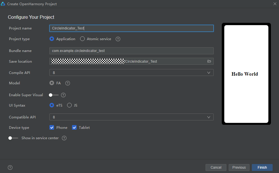
創(chuàng)建項目
如圖所示,在DevEco Studio中新建CircleIndicator_Test項目,項目類型選擇Application,語言選擇eTS,點擊Finish完成創(chuàng)建。
添加依賴
成功創(chuàng)建項目后,接下來就是將CircleIndicator組件下載至項目中。請在添加依賴之前參考如何安裝OpenHarmony npm包(https://gitee.com/openharmony-tpc/docs/blob/master/OpenHarmony_npm_usage.md)完成OpenHarmony npm環(huán)境配置。完成OpenHarmony npm環(huán)境配置之后,在DevEco Studio的底部導(dǎo)航欄,點擊“Terminal”(快捷鍵Alt+F12), 鍵入命令:npm install @ohos/circle-indicator --save并回車,此時CircleIndicator組件會自動下載至項目中。下載完成后工程根目錄下會生成node_modules/@ohos/CircleIndicator目錄。編寫邏輯代碼
提供多種Indicator,使用方法類似,以TriangularIndicator為例
1.初始化:實例化TabsController和對應(yīng)的Indicator.Model 對象, 并添加number類型成員以記錄當(dāng)前頁下標(biāo)
2.屬性設(shè)置:通過Model類對象設(shè)置UI屬性來自定義所需風(fēng)格,也可以添加所需的回調(diào)private controller: TabsController = new TabsController()model: TriangularIndicator.Model = new TriangularIndicator.Model(this.controller)itemIndex:number=0
3.界面繪制:在Tabs組件旁放置Indicator組件,注意需要關(guān)閉原生的bar。并監(jiān)聽Tabs組件的touch事件,通知給Model類,以統(tǒng)一處理滑動邏輯aboutToAppear() {this.model.setReverse(true).setLineHeight(4).setTriangleHeight(10).setLineColor("#e94220").setBackgroundColor("#eeeeee").setChangeListener((itemIndex) => {console.info("change page to " + this.data[itemIndex])})}
本期基于OpenHarmony API8的CircleIndicator組件1.0.3(https://gitee.com/openharmony-sig/CircleIndicator/tree/1.0.3)就為大家介紹到這,歡迎大家積極參與貢獻。了解更多三方組件動態(tài),請關(guān)注三方組件資源匯總(https://gitee.com/openharmony-tpc/tpc_resource),更多優(yōu)秀的組件等你來發(fā)現(xiàn)!build() {Column() {TriangularIndicator({ itemIndex: $itemIndex, count: this.data.length, model: this.model })Tabs({ index: this.itemIndex, controller: this.controller }) {……}.barWidth(0).onTouch((event: TouchEvent) => {this.model.notifyTouch(event, this.itemIndex)})}.padding({ top: 40 }).backgroundColor("#eeeeee")}
-
源碼
+關(guān)注
關(guān)注
8文章
668瀏覽量
30157 -
應(yīng)用程序
+關(guān)注
關(guān)注
38文章
3322瀏覽量
58756
原文標(biāo)題:CircleIndicator組件,使指示器風(fēng)格更加多樣化
文章出處:【微信號:gh_e4f28cfa3159,微信公眾號:OpenAtom OpenHarmony】歡迎添加關(guān)注!文章轉(zhuǎn)載請注明出處。
發(fā)布評論請先 登錄
【經(jīng)驗分享】在Omni3576上編譯Redis-8.0.2源碼,并安裝及性能測試
SSM框架的源碼解析與理解
源碼開放 智能監(jiān)測電源管理教程寶典!
需要做一個用ADS1282EVM-PDK實現(xiàn)信號數(shù)據(jù)采集功能的課題,請問有源碼么?
基于無操作系統(tǒng)的STM32單片機開發(fā)附源碼
ElfBoard技術(shù)貼|在NXP源碼基礎(chǔ)上適配ELF 1開發(fā)板的按鍵功能

LwIP協(xié)議棧源碼詳解—TCP/IP協(xié)議的實現(xiàn)
UWB智能定位系統(tǒng)源碼 UWB三維可視化人員定位系統(tǒng)源碼
基于java+單體服務(wù) +?硬件(UWB定位基站、卡牌)技術(shù)架構(gòu)開發(fā)的UWB室內(nèi)定位系統(tǒng)源碼


 工商網(wǎng)監(jiān)
評論